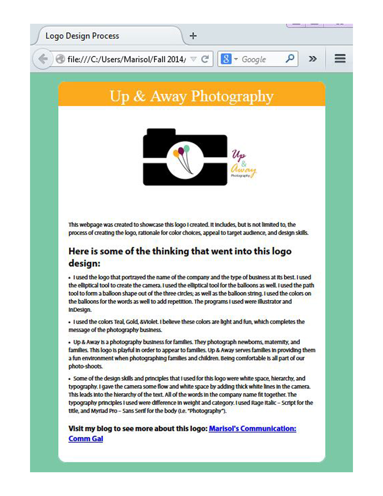
- Description: This is a webpage designed to showcase and explain a personal logo.
- Process (Programs, Tools, Skills): I created this webpage using Notepad, a text editor program. I began by editing the HTML and inserting the image on text for the webpage. I then attached a pre-made CSS file into my HTML to edit the colors and font of the webpage. I found the hex colors on Photoshop by inserting my logo into Photoshop and found the hex numbers using the eyedropper tool. I made the body text into Myriad Pro and the title Palatino. Both of these fonts have other sub fonts.
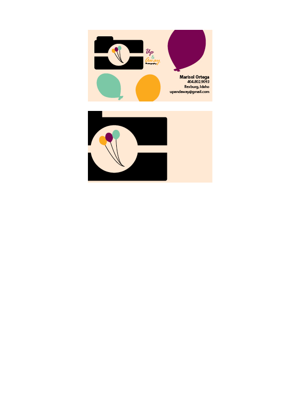
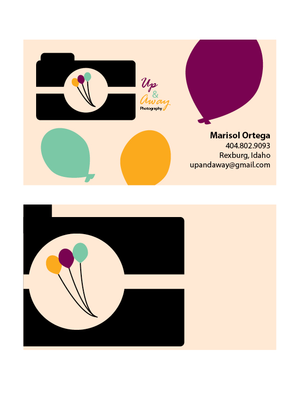
- Message: This company is a photography business for families (i.e. children, maternity photos, and family photos.)
- Audience: Anyone who needs a photographer for family portraits, maternity photos, or other family photos.
- Top Thing Learned: I learned how to use CSS to personalize a webpage with colors and font.
- Color scheme and color hex(s): Triadic: Teal #7bc8a6; Gold #fbaa1d; White #FFFFFF;
- Title Font Families & Category: Palatino, “Angsana New Italic”, serif; Serif
- Copy Font Families & Category: “Myriad Pro”,Helvetica, sans-serif; Sans-Serif
- Changes made to the CSS: I changed the colors and font.
- Word Count: 237
Monthly Archives: November 2014
Project 6: Stationary
- Description: This is business card and letterhead for a photography business. The business card and letterhead are matching designs.
- Process (Programs, Tools, Skills): I began these designs by sketching out possible designs. I used the logo that portrayed the name of company and the type of business it is best. I used the elliptical tool to create the camera. As well as the balloons. I used the path tool to form a balloon shape out of the three circles; as well as the balloon string. I used the colors on the balloons for the words as well to add repetition. The programs I used were Illustrator and InDesign.
- Message: Up & Away is a photography business for families. They photograph newborns, maternal, and families. This logo is playful in order to appear to the younger audiences and families.
- Audience: The audience is families.
- Top Thing Learned: I learned that consistency gives the company a theme and makes it memorable.
- Color scheme and color names: Big Split Complementary; Teal, Gold, Brick, Violet.
- Title Font Name & Category: Rage Italic – Script
- Copy Font Name & Category: Myriad Pro – Sans Serif
Project 5: Logos
- Description: These are three different logos for a restaurant called, “Violet.”
- Process (Programs, Tools, Skills): I had a really fun time designing on Illustrator. The process was very fun to explore. My top logo was created with the pen tool. I then created the wine glasses with the ellipse tool. My middle logo was created with many ovals using the ellipse tool to design a chandelier. The “V” was created with two triangles. The bottom logo was created with a rectangle and a triangle to form a “V”.
- Message: Violet is a fine cuisine restaurant that is modern and elegant.
- Audience: People looking for a modern and elegant place to dine in.
- Top Thing Learned: I learned that watching the tutorials helps me teach myself, making this learning experience more valuable.
- Three Color Scheme and Color Names: Top logo: Black; Middle Logo: Monochromatic; Bottom logo: Analagous. Color names- Top Logo: Black; Middle Logo: Violet; Bottom Logo: Purple, Violet, Red.
- Top Logo – Font #1 Name & Category: Myriad Pro; Oldstyle
Top Logo – Font #2 Name & Category: Microsoft Yi Baiti: Sans Serif Middle Logo – Font #1 Name & Category: No font
Middle Logo – Font #2 Name & Category: No font - Votes on favorite logo: Top Logo = _4__; Middle Logo = _1__; Bottom Logo = _8__;
- My favorite logo is ___Top Logo___.