
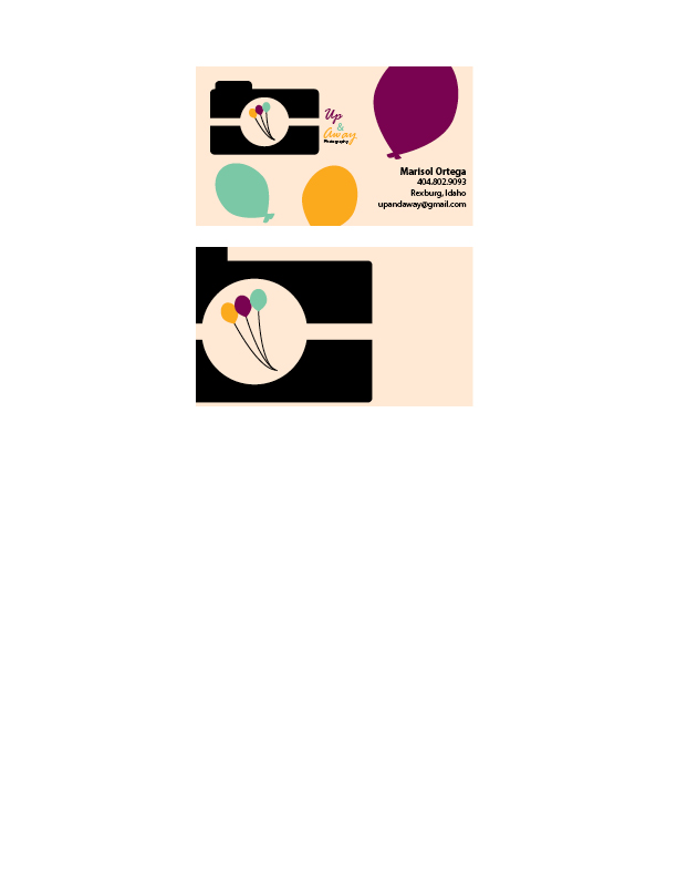
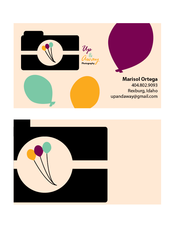
- Description: This is business card and letterhead for a photography business. The business card and letterhead are matching designs.
- Process (Programs, Tools, Skills): I began these designs by sketching out possible designs. I used the logo that portrayed the name of company and the type of business it is best. I used the elliptical tool to create the camera. As well as the balloons. I used the path tool to form a balloon shape out of the three circles; as well as the balloon string. I used the colors on the balloons for the words as well to add repetition. The programs I used were Illustrator and InDesign.
- Message: Up & Away is a photography business for families. They photograph newborns, maternal, and families. This logo is playful in order to appear to the younger audiences and families.
- Audience: The audience is families.
- Top Thing Learned: I learned that consistency gives the company a theme and makes it memorable.
- Color scheme and color names: Big Split Complementary; Teal, Gold, Brick, Violet.
- Title Font Name & Category: Rage Italic – Script
- Copy Font Name & Category: Myriad Pro – Sans Serif
