Front
Inside
Back
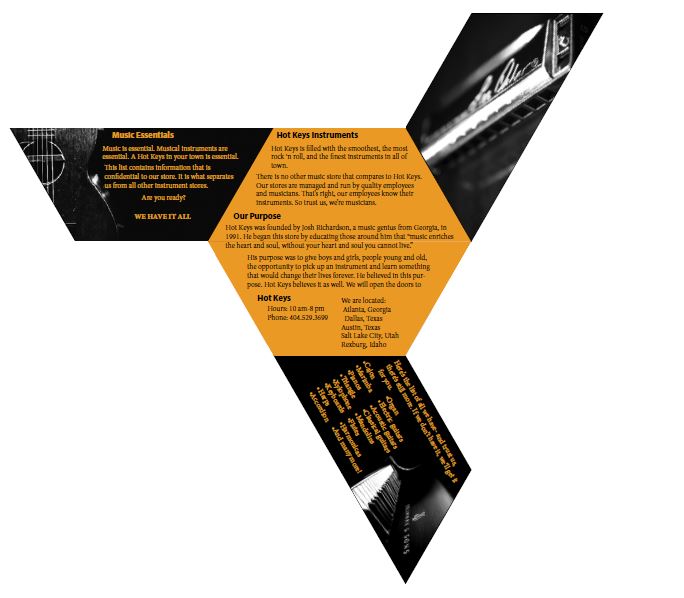
- Description: This is a full bleed, two-sided brochure
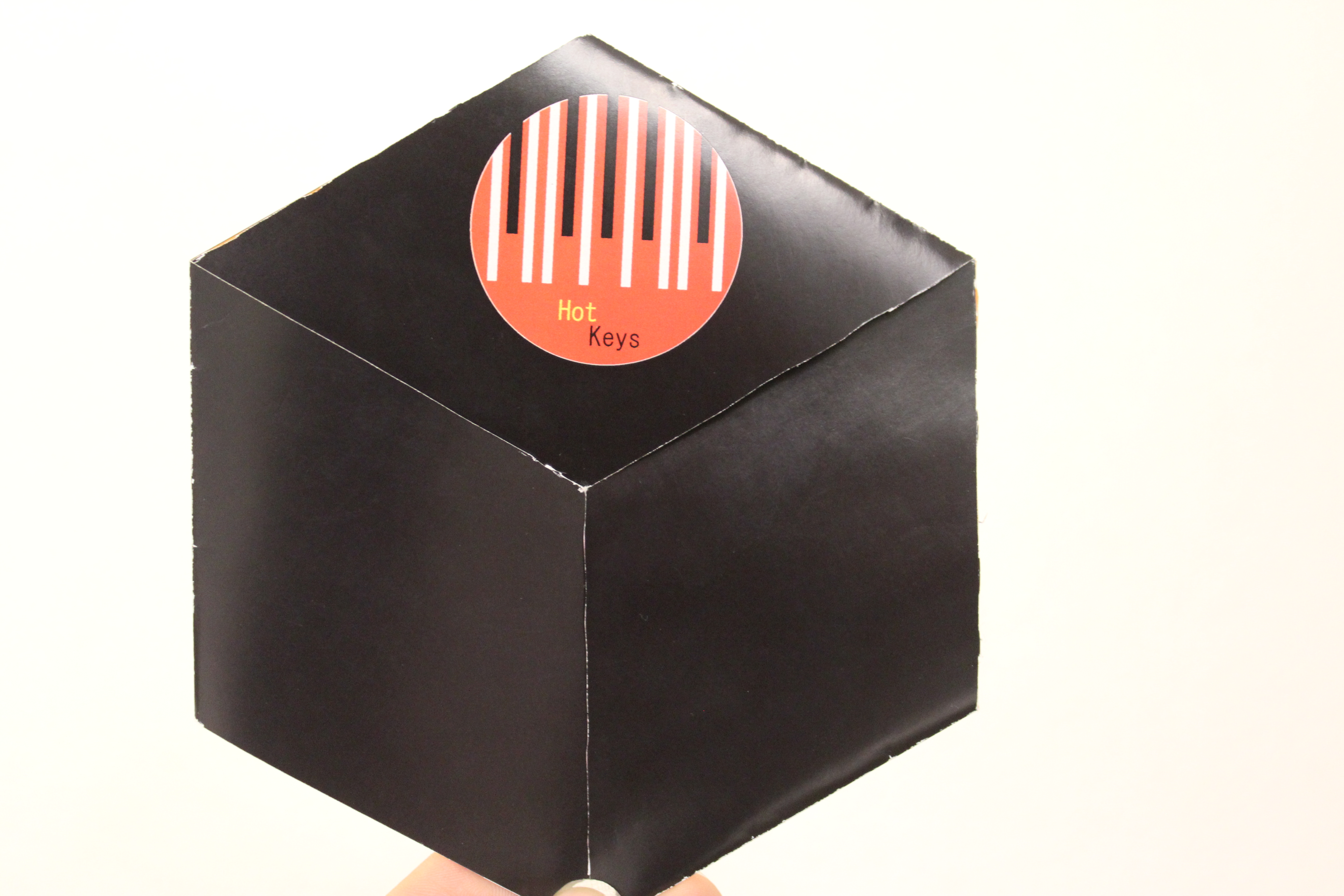
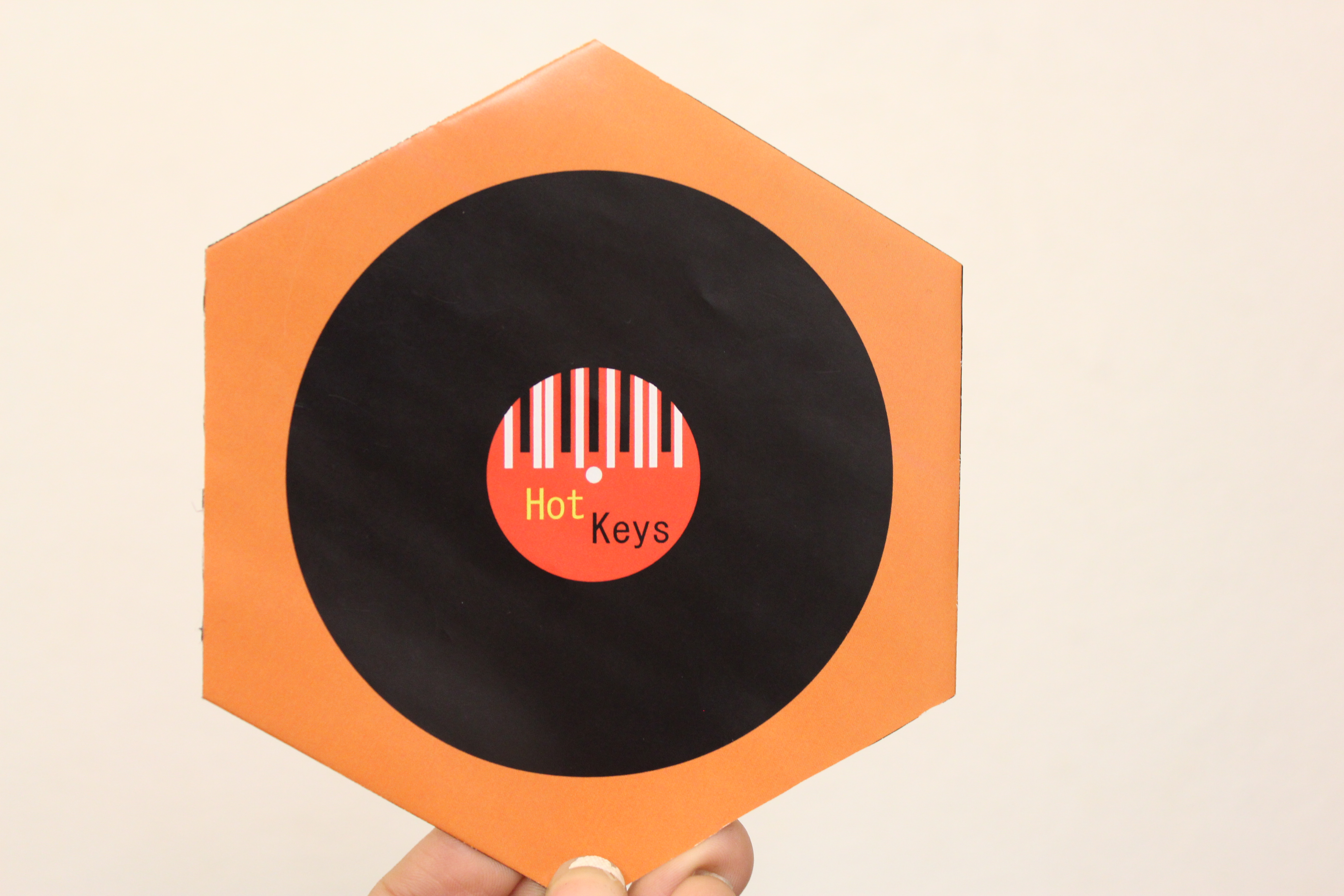
- Process (Programs, Tools, Skills): I began by designing the logo for this brochure. I used the rectangle tool and ellipse tool. I used the rectangle tool to make things stripes to look like piano keys. I knew what the brochure was for so this helped me design the mock up of the brochure. It took me a couple hours to figure out the measurements of the brochure. It turned out being a hexagon with half hexagons being flaps so that they folded in. I then opened InDesign and created a 6 x 6 in hexagon. I cut the hexagon in half and created the flaps. I then opened Illustrator, where I created the logo, to create a record with the logo inside of it. I opened the logo and record logo in Indesign and placed them on the 2nd page (back) of the brochure. The programs I used were Adobe Indesign and Adobe Illustrator.
- Message: Inform musicians of a musical instrument store that has the latest instruments.
- Audience: The audience is anyone who is looking to purchase an instrument.
- Top Thing Learned: I learned that alignment is very important when creating a brochure.
- Color scheme and color names: Analogous; Brick, Orange, Gold.
- Title Font Name & Category: Myriad Pro; Sans Serif
- Copy Font Name & Category: Minion Pro; Oldstyle
- Word Count of copy: 272
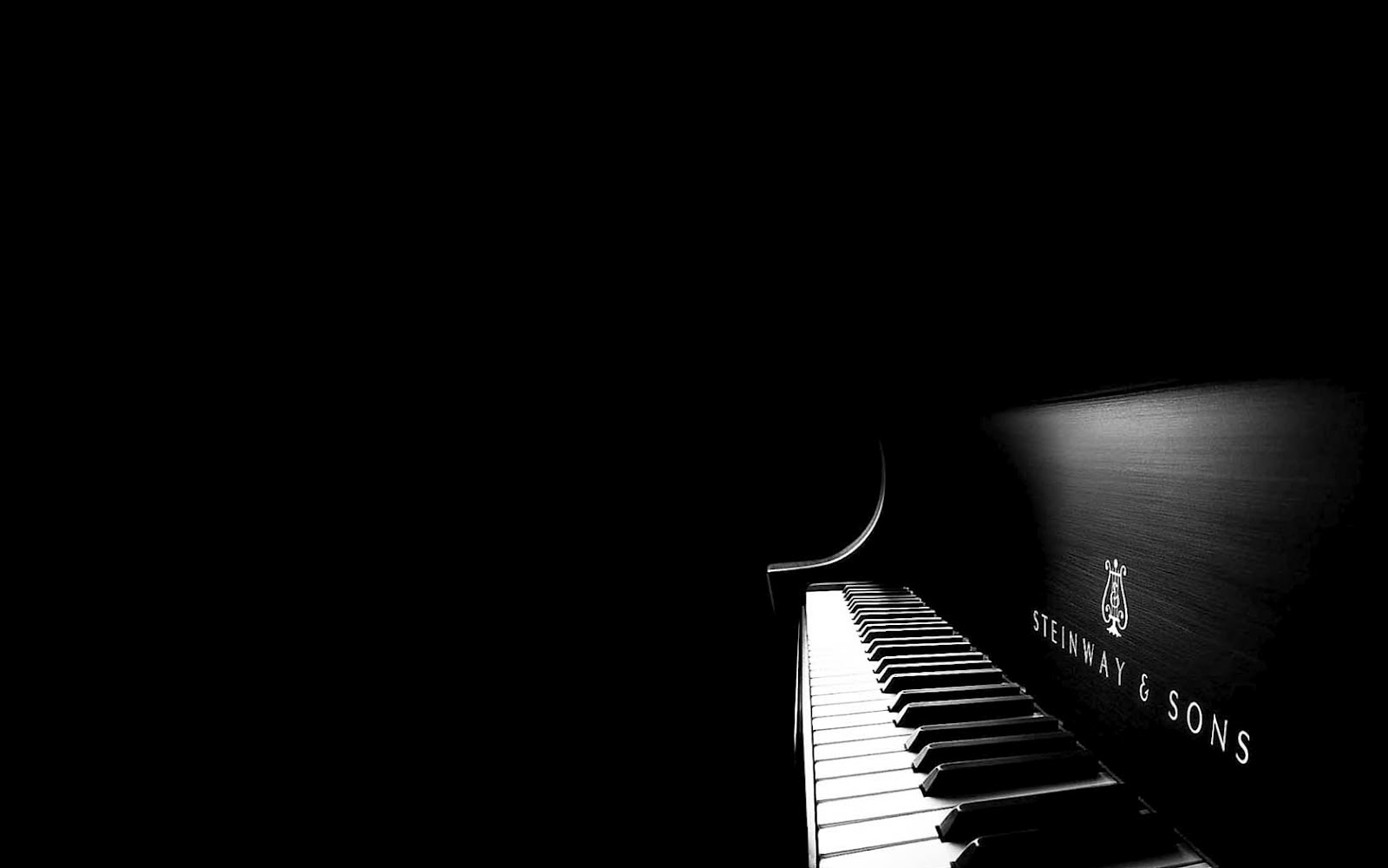
- Thumbnails of Images used:
- Souces (Links to images on original websites)
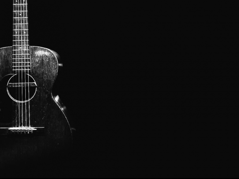
http://www.appszoom.com/android_themes/wallpapers/acoustic-guitar-hd-wallpapers_chidm.html
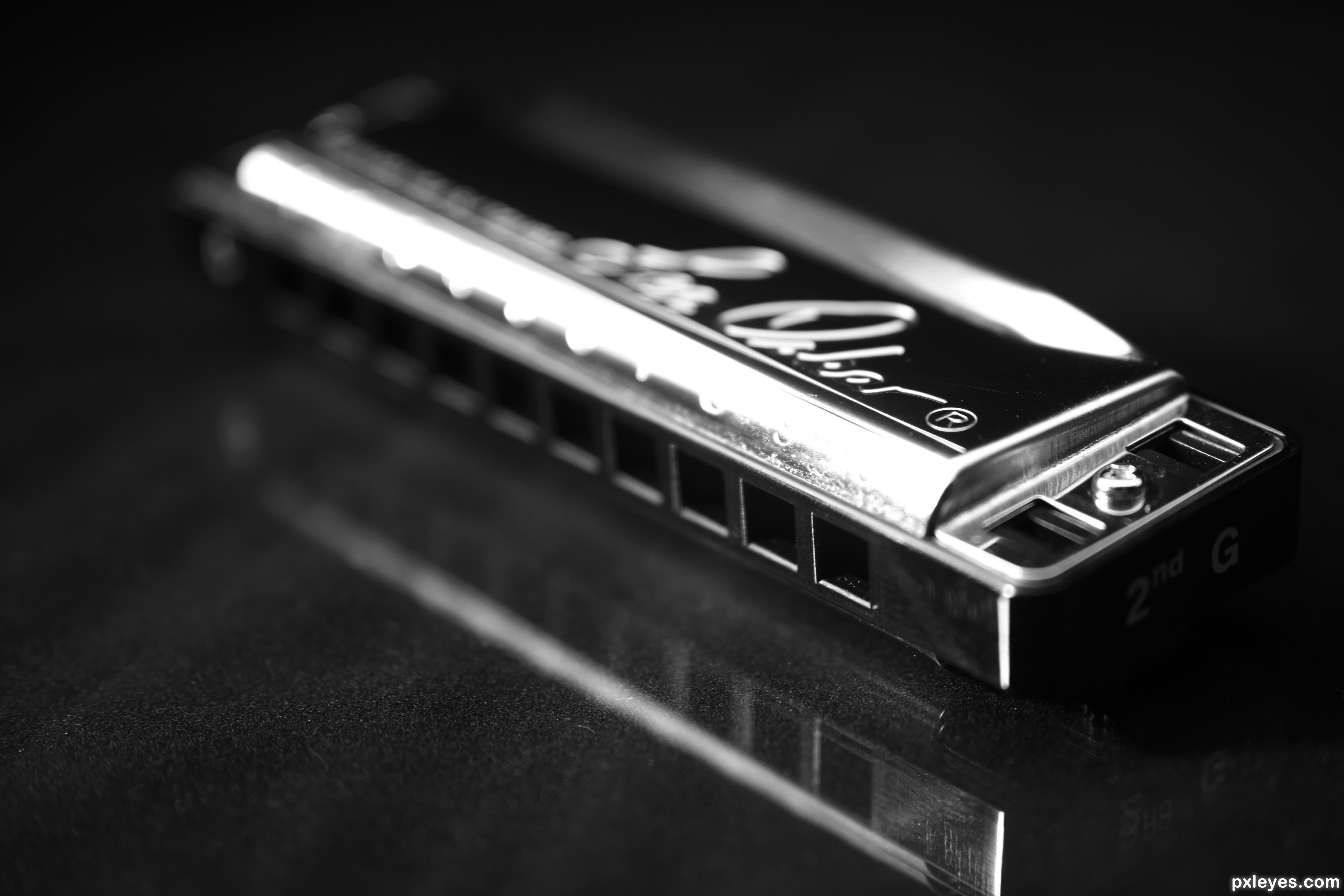
http://www.pxleyes.com/photography-picture/51d7491de7cfa/Mr–Harmonica-s-instrument.html

Marisol, I think your brochure was my favorite. I love the way it opens up. I am so impressed with how you were able to do that! I love your color scheme, it matches the music theme. I think you did a great job with the layout on the inside of the brochure. This was overall a really great brochure with a very unique design. Good job!
You can check out my blog here: https://charlottearay.wordpress.com/