- Project Corrections / Time spent: I spent 15 minutes fixing the text in my brochure where it says, “We will open the doors to your learning something new; you just need to walk through ours.” I fixed this because I had not completed the text when I turned it in this past weekend. I also redid my entire Photodesign project. I did not like the colors and the shapes, so I picked a picture that had a good color scheme and I added a quote by Henry B. Eyring.
- Message: To portray my professional work in a clean and organized manner.
- Audience: Potential clients and employers.
- Top Thing Learned: I learned how to work with master pages.
- Future application of Visual Media: I will always try to do amazing work in all I do. This class helped me stretch my creativity.
- Color scheme and color names: Monochromatic: Teal
- Title Font Name & Category: Gabriola; Script
- Copy Font Name & Category: Microsoft PhagsPa; Sans Serif
- Thumbnails of Images used: No Images
- Sources (Links to images on original websites / with title of site): No sources
Monthly Archives: December 2014
Project 8: Brochure
Front
Inside
Back
- Description: This is a full bleed, two-sided brochure
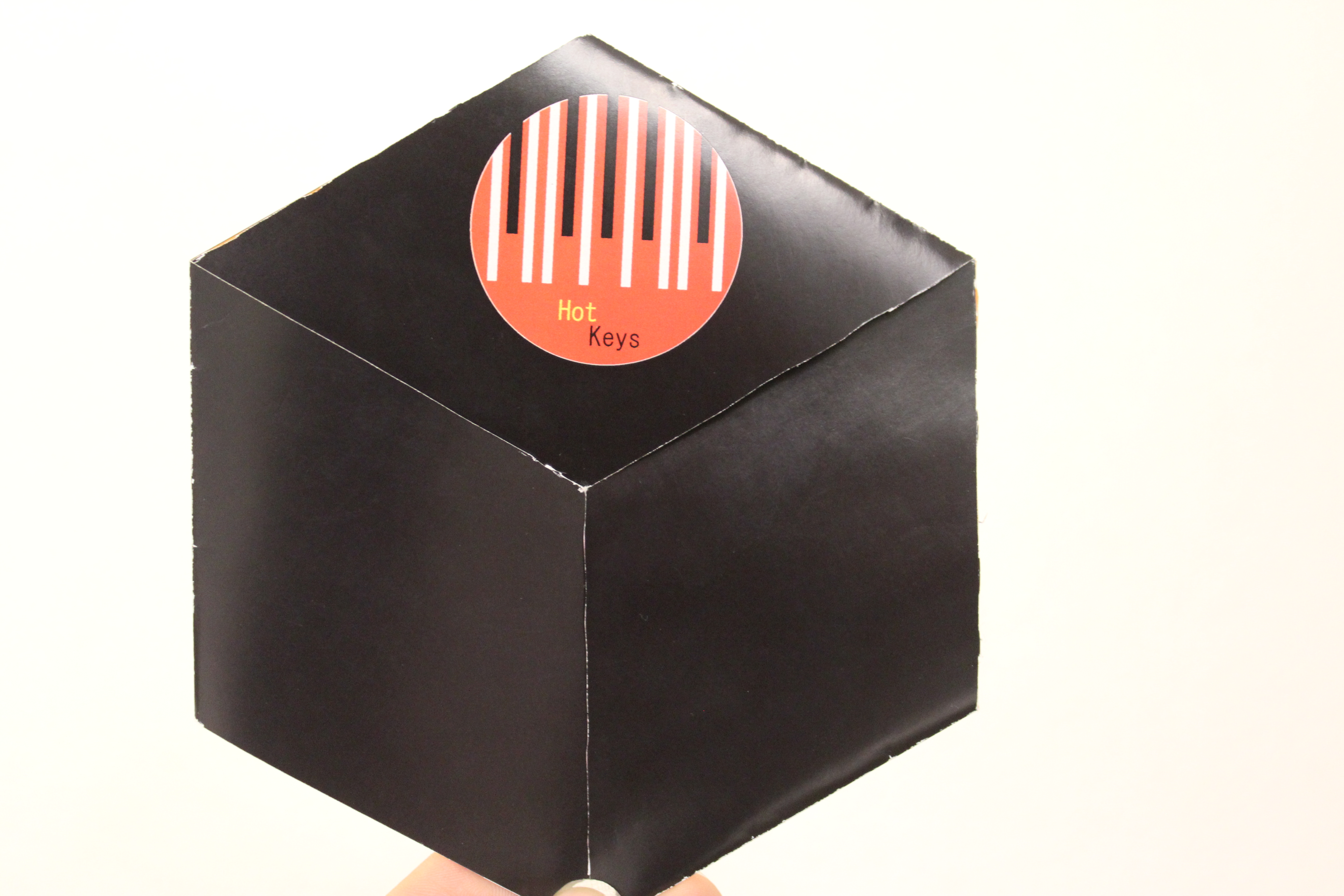
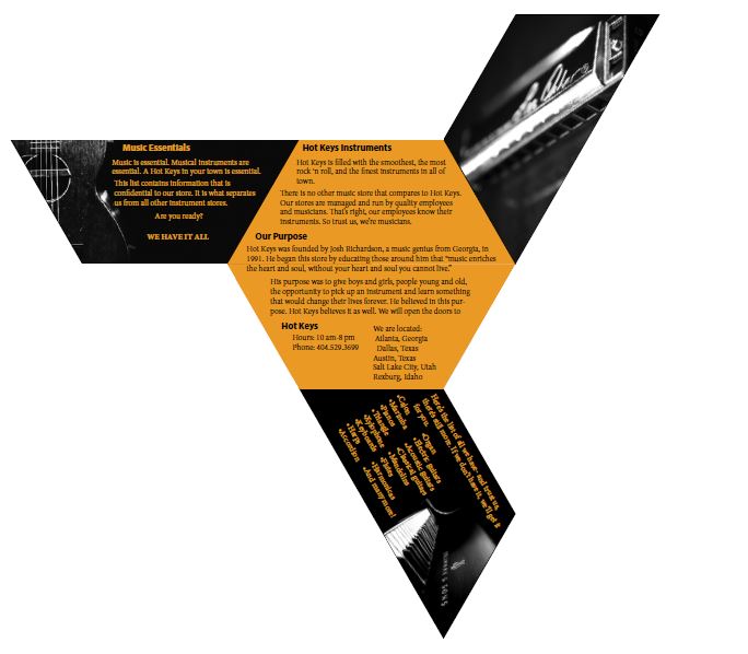
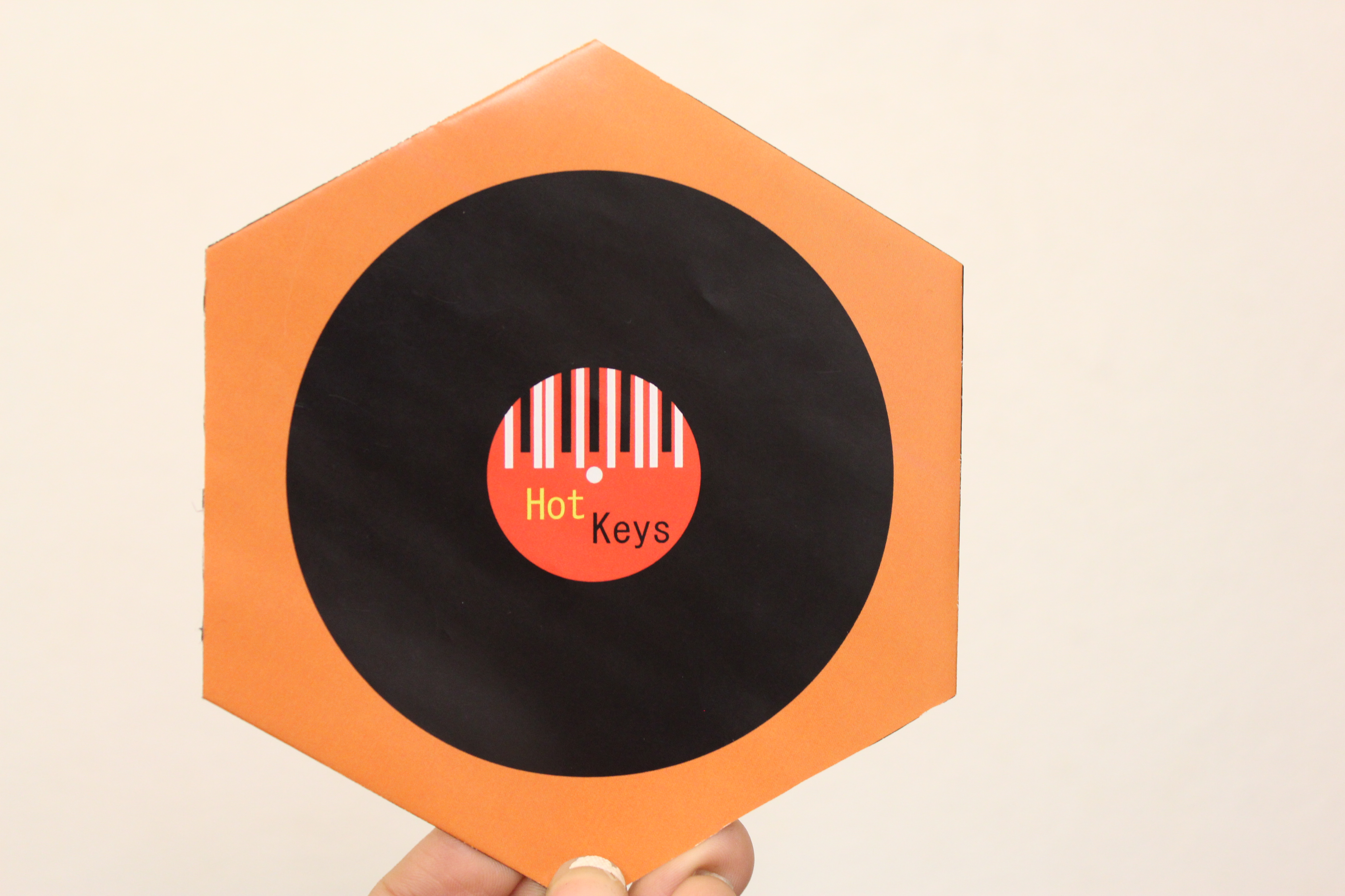
- Process (Programs, Tools, Skills): I began by designing the logo for this brochure. I used the rectangle tool and ellipse tool. I used the rectangle tool to make things stripes to look like piano keys. I knew what the brochure was for so this helped me design the mock up of the brochure. It took me a couple hours to figure out the measurements of the brochure. It turned out being a hexagon with half hexagons being flaps so that they folded in. I then opened InDesign and created a 6 x 6 in hexagon. I cut the hexagon in half and created the flaps. I then opened Illustrator, where I created the logo, to create a record with the logo inside of it. I opened the logo and record logo in Indesign and placed them on the 2nd page (back) of the brochure. The programs I used were Adobe Indesign and Adobe Illustrator.
- Message: Inform musicians of a musical instrument store that has the latest instruments.
- Audience: The audience is anyone who is looking to purchase an instrument.
- Top Thing Learned: I learned that alignment is very important when creating a brochure.
- Color scheme and color names: Analogous; Brick, Orange, Gold.
- Title Font Name & Category: Myriad Pro; Sans Serif
- Copy Font Name & Category: Minion Pro; Oldstyle
- Word Count of copy: 272
- Thumbnails of Images used:
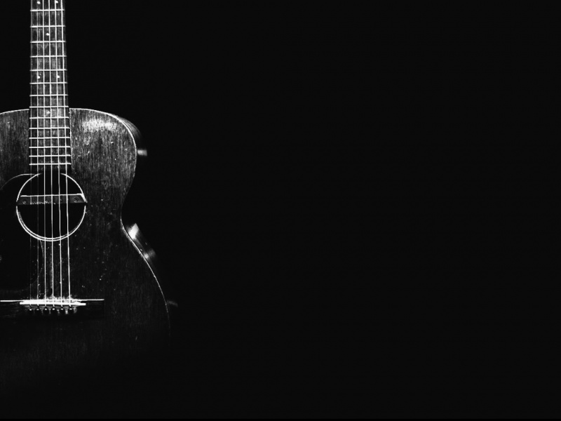
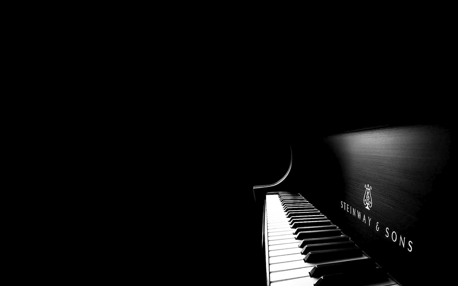
- Souces (Links to images on original websites)
http://www.appszoom.com/android_themes/wallpapers/acoustic-guitar-hd-wallpapers_chidm.html
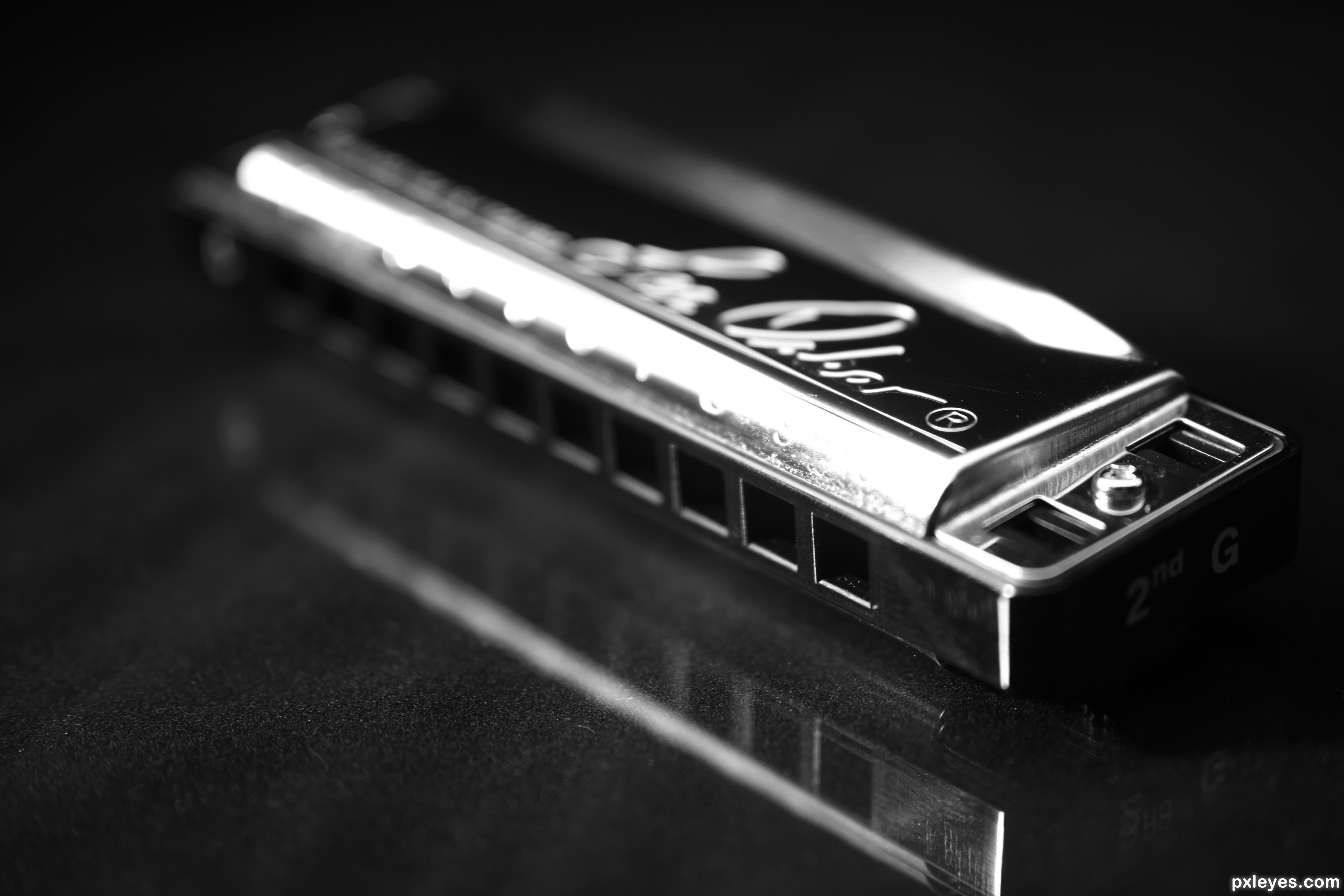
http://www.pxleyes.com/photography-picture/51d7491de7cfa/Mr–Harmonica-s-instrument.html
