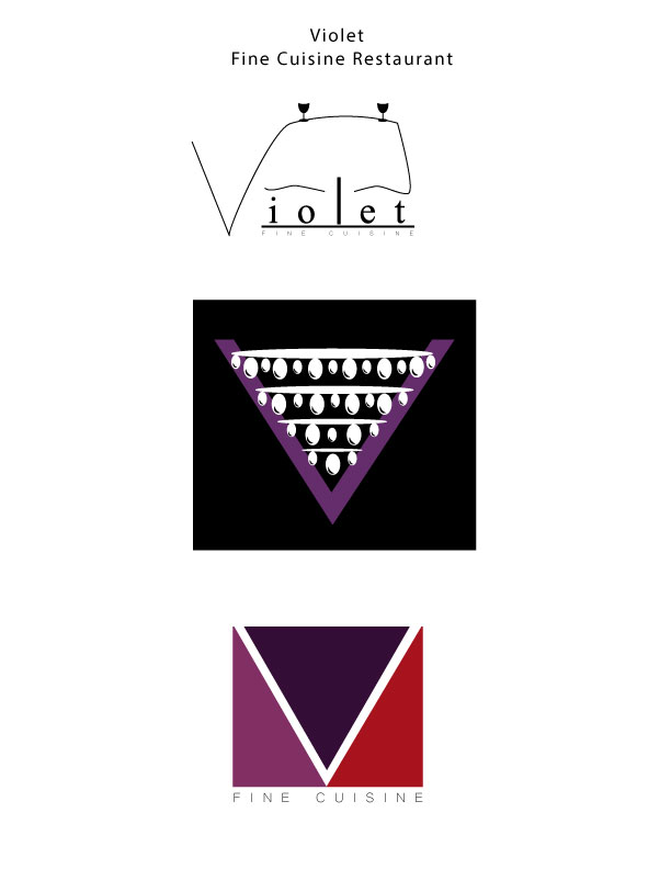
- Description: These are three different logos for a restaurant called, “Violet.”
- Process (Programs, Tools, Skills): I had a really fun time designing on Illustrator. The process was very fun to explore. My top logo was created with the pen tool. I then created the wine glasses with the ellipse tool. My middle logo was created with many ovals using the ellipse tool to design a chandelier. The “V” was created with two triangles. The bottom logo was created with a rectangle and a triangle to form a “V”.
- Message: Violet is a fine cuisine restaurant that is modern and elegant.
- Audience: People looking for a modern and elegant place to dine in.
- Top Thing Learned: I learned that watching the tutorials helps me teach myself, making this learning experience more valuable.
- Three Color Scheme and Color Names: Top logo: Black; Middle Logo: Monochromatic; Bottom logo: Analagous. Color names- Top Logo: Black; Middle Logo: Violet; Bottom Logo: Purple, Violet, Red.
- Top Logo – Font #1 Name & Category: Myriad Pro; Oldstyle
Top Logo – Font #2 Name & Category: Microsoft Yi Baiti: Sans Serif Middle Logo – Font #1 Name & Category: No font
Middle Logo – Font #2 Name & Category: No font - Votes on favorite logo: Top Logo = _4__; Middle Logo = _1__; Bottom Logo = _8__;
- My favorite logo is ___Top Logo___.

Each of your designs are very unique and different. I love the colors you used for the last one. I think that the first one is really creative. I would have never thought to make a table out of the word Violet. You did a really great job!
You can check my blog out here: http://charlottearay.wordpress.com/
Marisol, I really like your designs, particularly the last one. The color scheme works well with the rule of odds. Your alignment looks spot on. these are very creative designs. Here is the link to my blog, http://kenziestevens22comm.wordpress.com
Marisol! Great job on your logos. I love the colors that you used. Great use of alignment and typography. I think you have a really good focal point in all of your designs they really catch your eye. The way you made a table out of the letter v is very impressive. Overall great job!