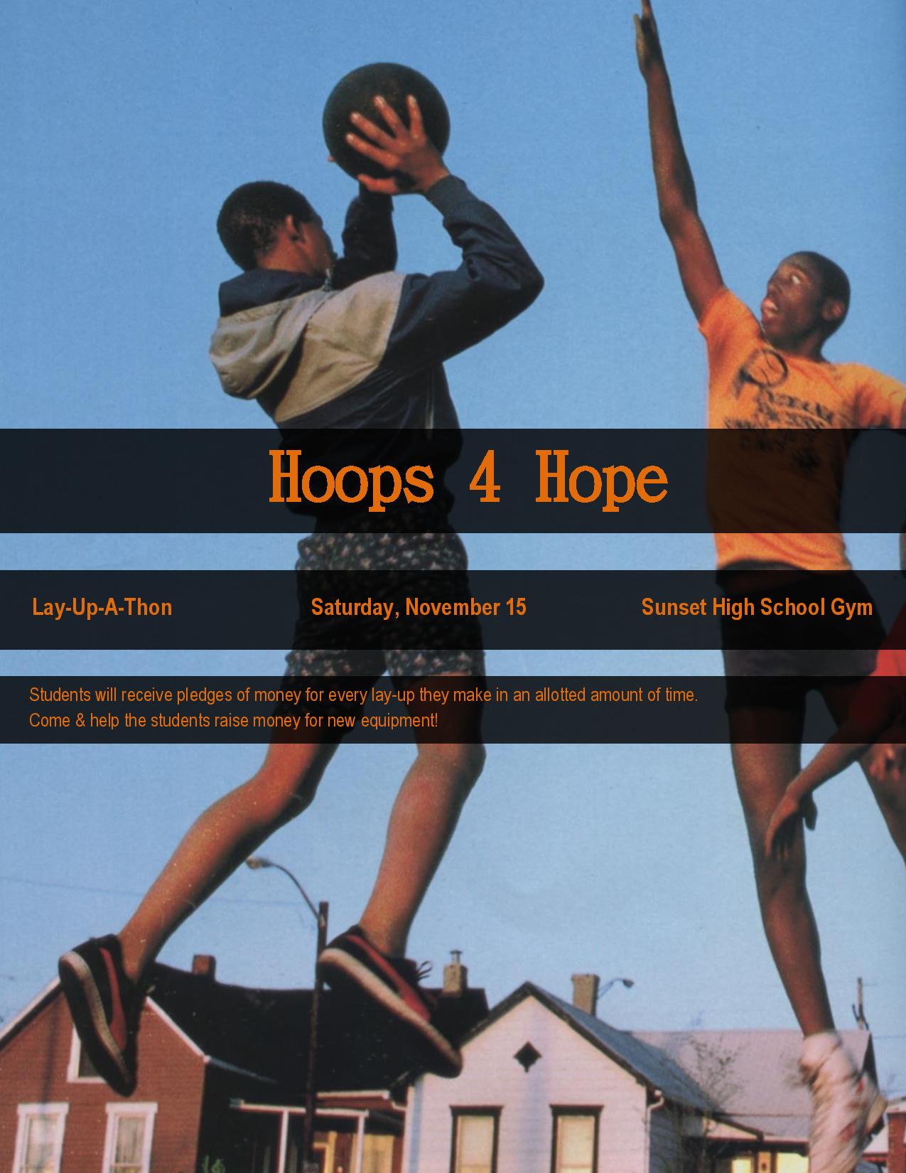
- Description: This is a color event ad used to promote a fundraiser called, “Hoops 4 Hope”. It was created using Microsoft.
- Process (Programs, Tools, Skills): I began this project by scanning in a photo of two young boys playing basketball. I then opened it up in Microsoft Word and made it the background of the ad. I added 3 rectangles to follow the rule of odds. I looked at the color scheme of the photo and noticed that orange text would match the young mans shirt. This was a great color scheme: blue and orange. I put the three rectangles in the center because even with them on the center of the photo one can see what is going on. If it were in the bottom or top, it would throw off the image. I used a text that looked retro to match the 80’s ad.
- Message: I created this ad for an organization called, “Hoops 4 Hope.” I want those who see the ad to know that this fundraiser will help the youth and allow them to keep playing basketball at their school. The ad is simple because I want them to know it is all about the youth.
- Audience: The audience is students that attend Sunset High School, parents of the students, and those in the community.
- Color scheme and color names: Complementary, Blue & Orange.
- Top Thing Learned: I learned how much fun it is to work with color scheme. And that it is a very important element of design.
- Title Font Name & Category: DFKai-SB – Slab Serif
- Copy Font Name & Category: Arial Narrow – Sans Serif
- Scanned images used, sources, original sizes, location of scanner used:
This image was scanned from the August 1987 National Geographic magazine. The image was originally 6.2” x 9.64”. I scanned the image at 200 dpi to make the image larger. The final size of image was 1242” x 1925”.

Hey Marisol, great picture for this ad! I like the contrast between the long, vertical lines of the basketball players and the horizontal lines of the event info. Good use of the rule of thirds with the event info in the middle third. Fun ad! (I’d love to go to an event like this!)
Here’s a link to my ad: http://britstanford.wordpress.com/category/design/