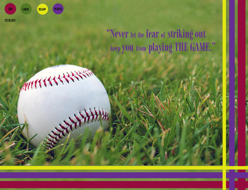
- Description: This is an inspirational poster that portrays good photography and image editing skills. The image used for this photo is an original and was edited to go with the poster.
- Process (Programs, Tools, Skills): I began this design by taking a lead room photo that had a color scheme I could work with. I took the photo with a T5 Rebel Canon camera. I used a lead room baseball photo that I could use for an inspirational sport poster. After taking some photos, I used Photoshop to edit and enhance the color I would be using for the design. I used the following edit techniques: Levels, Vibrance, Sharping tool, and Patch tool. I added thin rectangles for repetition, rule of odds, and asymmetry to contrast the round shape of the baseball. I added a quote that was motivational and included sport terminology.
- Message: I wanted to create a motivational poster that could relate to life as well as sports.
- Audience: I decided to make the poster youthful and appealing to a modern audience.
- Top Thing Learned: I learned how important it is to size things from the beginning. I also learned that it is possible to make something appealing when something is forced into the design.
- Color scheme and color names: Tetradic: Red, Green, Yellow, Purple
- Title Font Name & Category: Font: Modern 735 BT Alt; Category: Modern
- Copy Font Name & Category: No copy font.
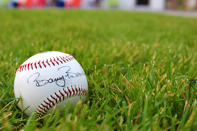
- Thumbnail of original, unedited image inserted

- Date and location you took the photo(s) Tuesday, October 14, Sunrise Village lawn area.

I really like this. I really like how you focus in on the baseball, that is immediately what my eye was drawn to. I like the amount of white space and the alignment of the colored stripes. I like the repetition of the stripes, it creates a good rhythm. I think you did a really nice job with this.
Link back: http://charlottearay.wordpress.com/2014/10/18/44/
I really enjoyed this project and design because the colors made it pop out to me. I loved how you used a tetradic color scheme. Not many other people used this color scheme that I saw. I also love baseball which may be another reason I was drawn to this design. The placement of the baseball follows the rule of thirds and works really well in the design.
https://apex2060.wordpress.com/