- Project Corrections / Time spent: I spent 15 minutes fixing the text in my brochure where it says, “We will open the doors to your learning something new; you just need to walk through ours.” I fixed this because I had not completed the text when I turned it in this past weekend. I also redid my entire Photodesign project. I did not like the colors and the shapes, so I picked a picture that had a good color scheme and I added a quote by Henry B. Eyring.
- Message: To portray my professional work in a clean and organized manner.
- Audience: Potential clients and employers.
- Top Thing Learned: I learned how to work with master pages.
- Future application of Visual Media: I will always try to do amazing work in all I do. This class helped me stretch my creativity.
- Color scheme and color names: Monochromatic: Teal
- Title Font Name & Category: Gabriola; Script
- Copy Font Name & Category: Microsoft PhagsPa; Sans Serif
- Thumbnails of Images used: No Images
- Sources (Links to images on original websites / with title of site): No sources
Project 8: Brochure
Front
Inside
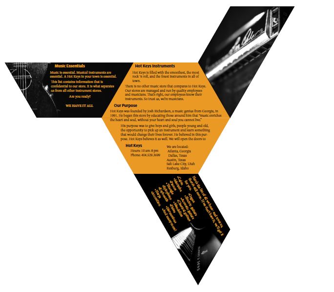
Back
- Description: This is a full bleed, two-sided brochure
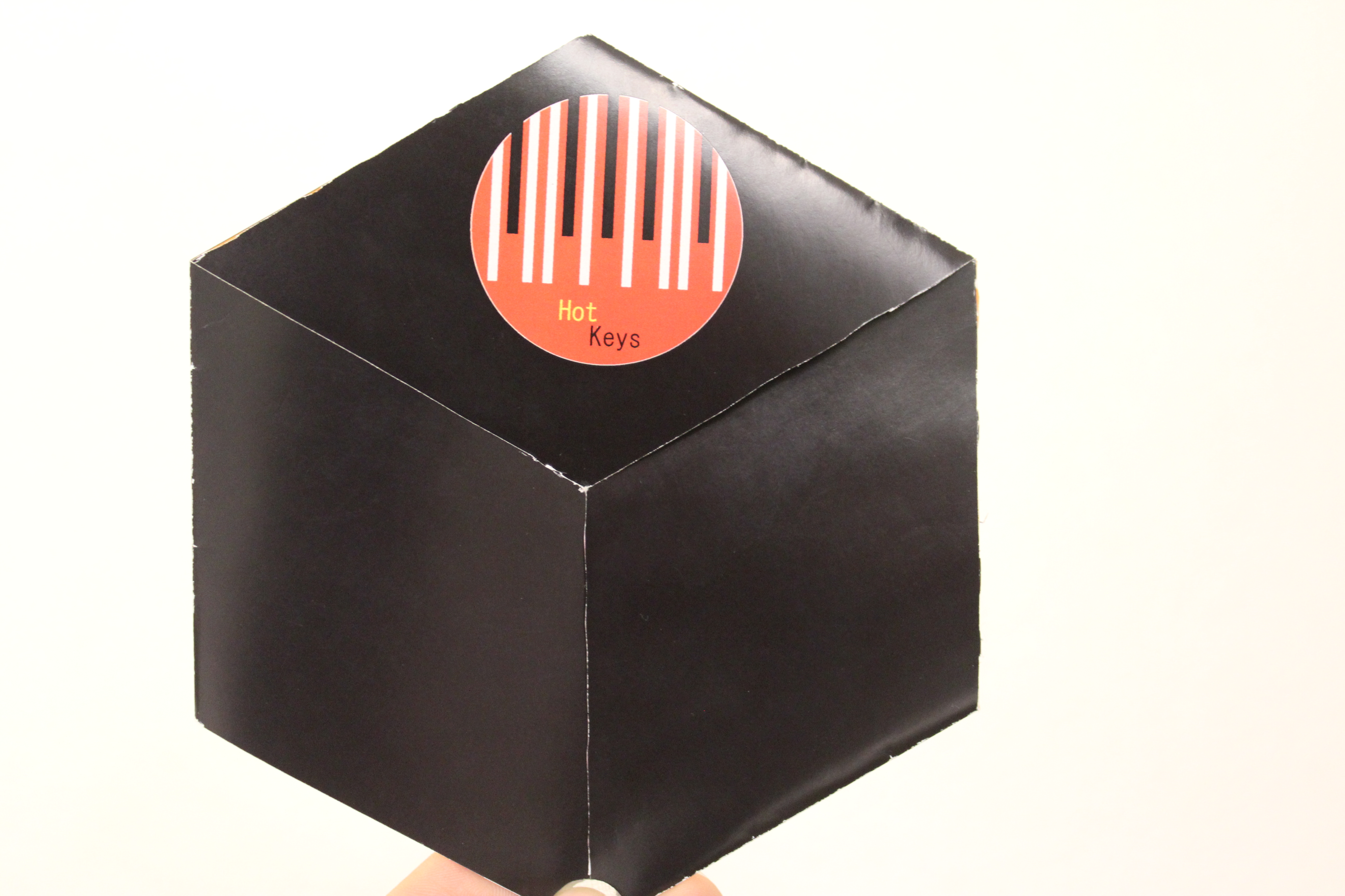
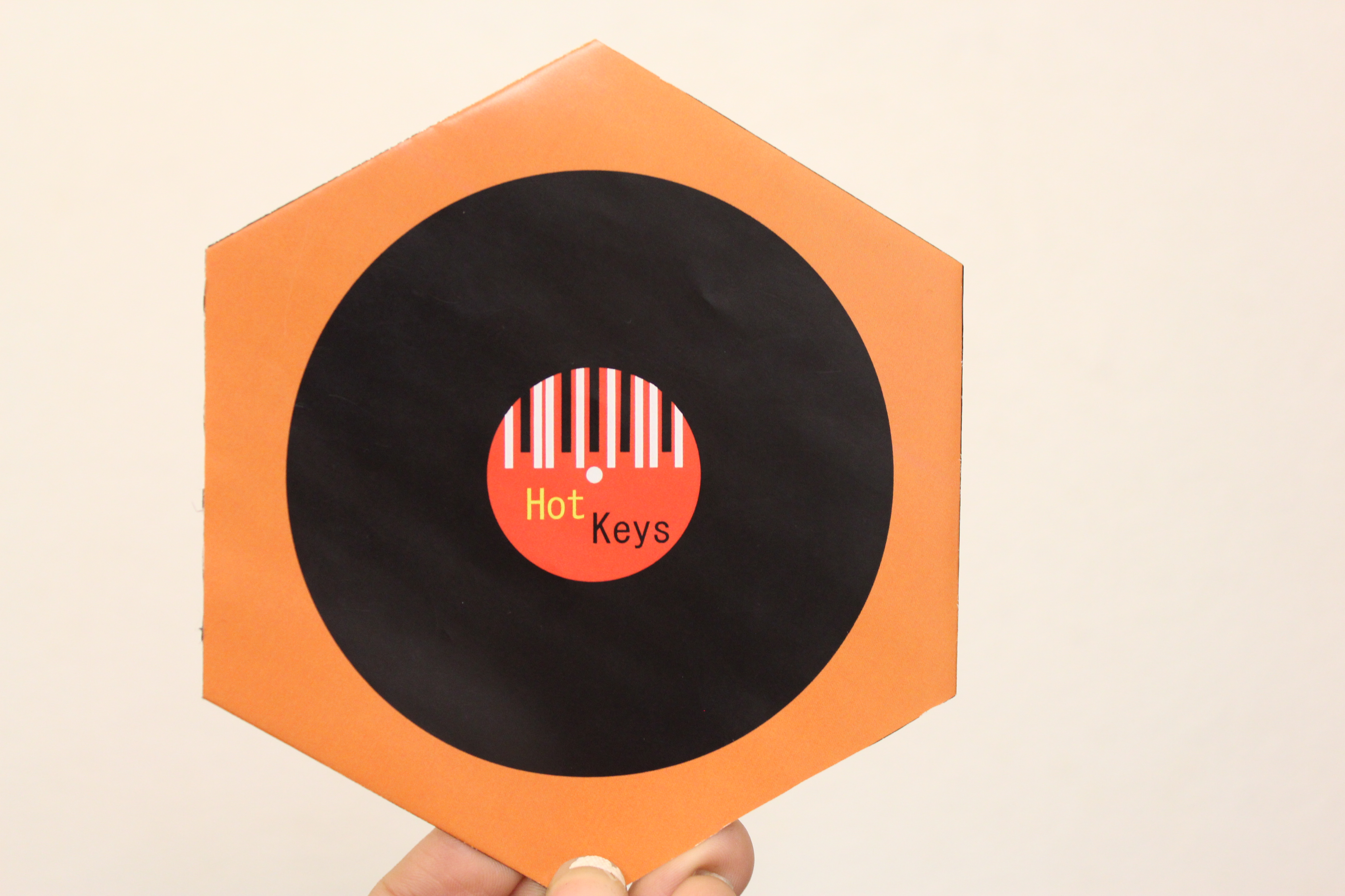
- Process (Programs, Tools, Skills): I began by designing the logo for this brochure. I used the rectangle tool and ellipse tool. I used the rectangle tool to make things stripes to look like piano keys. I knew what the brochure was for so this helped me design the mock up of the brochure. It took me a couple hours to figure out the measurements of the brochure. It turned out being a hexagon with half hexagons being flaps so that they folded in. I then opened InDesign and created a 6 x 6 in hexagon. I cut the hexagon in half and created the flaps. I then opened Illustrator, where I created the logo, to create a record with the logo inside of it. I opened the logo and record logo in Indesign and placed them on the 2nd page (back) of the brochure. The programs I used were Adobe Indesign and Adobe Illustrator.
- Message: Inform musicians of a musical instrument store that has the latest instruments.
- Audience: The audience is anyone who is looking to purchase an instrument.
- Top Thing Learned: I learned that alignment is very important when creating a brochure.
- Color scheme and color names: Analogous; Brick, Orange, Gold.
- Title Font Name & Category: Myriad Pro; Sans Serif
- Copy Font Name & Category: Minion Pro; Oldstyle
- Word Count of copy: 272
- Thumbnails of Images used:
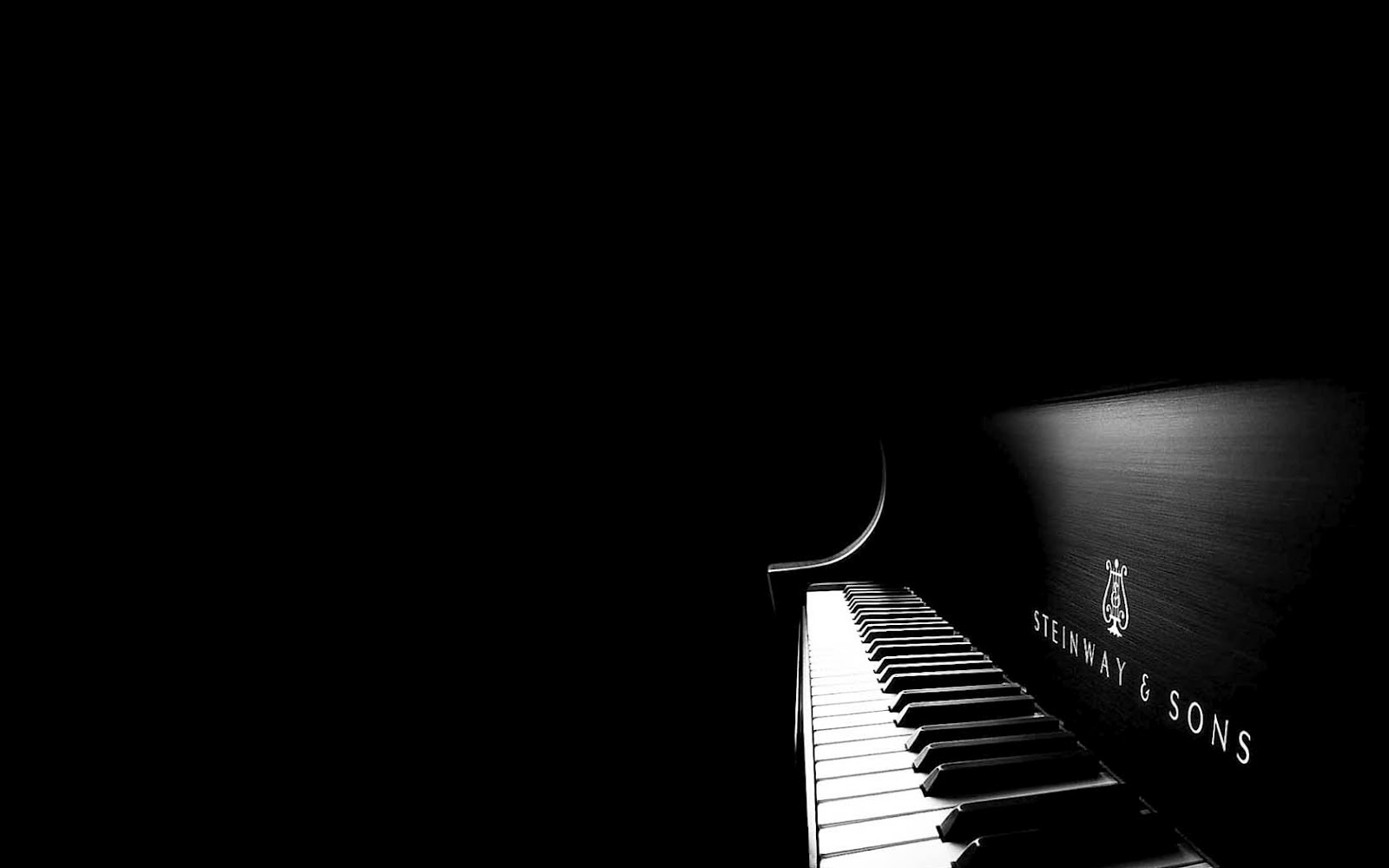
- Souces (Links to images on original websites)
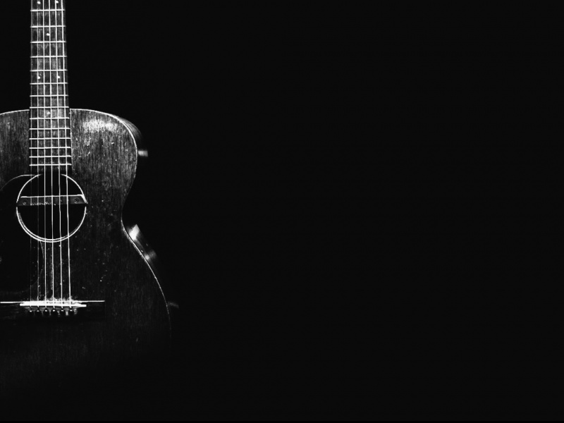
http://www.appszoom.com/android_themes/wallpapers/acoustic-guitar-hd-wallpapers_chidm.html
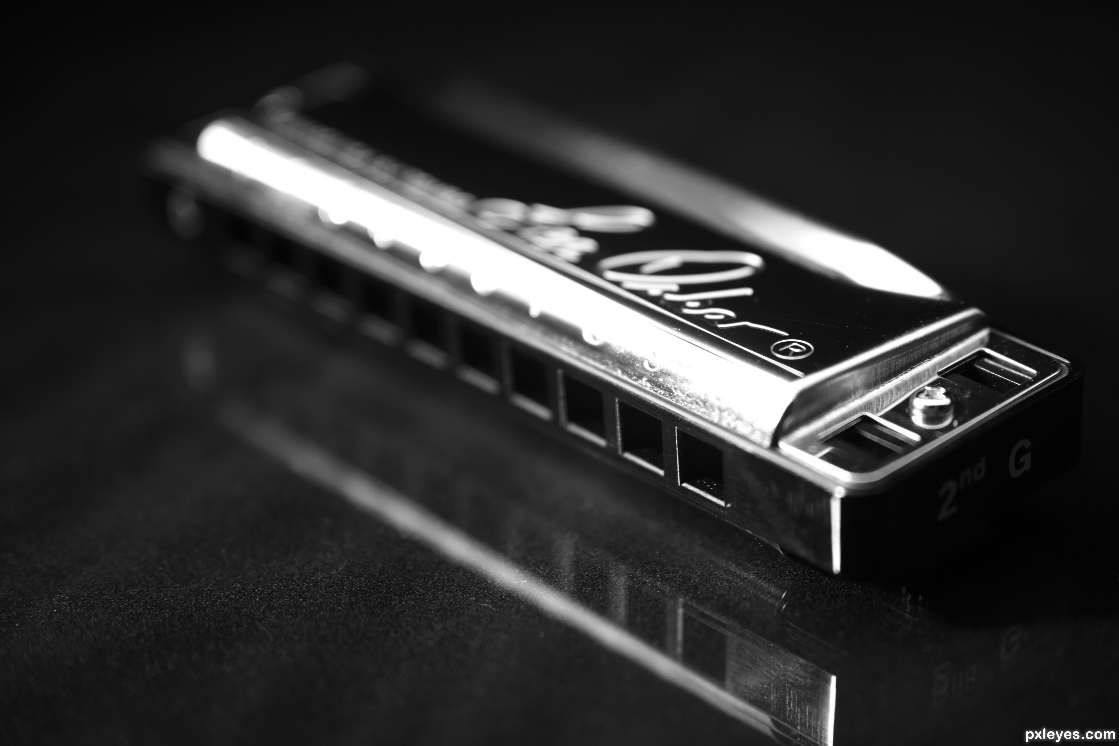
http://www.pxleyes.com/photography-picture/51d7491de7cfa/Mr–Harmonica-s-instrument.html
Project 7: Web Page
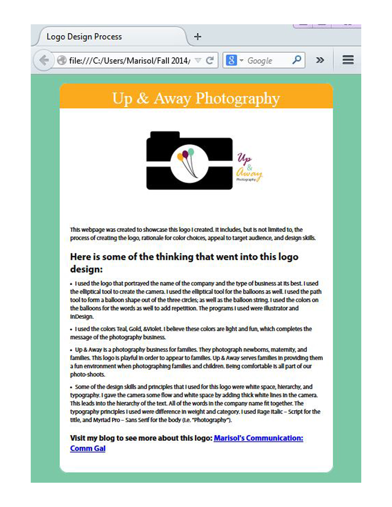
- Description: This is a webpage designed to showcase and explain a personal logo.
- Process (Programs, Tools, Skills): I created this webpage using Notepad, a text editor program. I began by editing the HTML and inserting the image on text for the webpage. I then attached a pre-made CSS file into my HTML to edit the colors and font of the webpage. I found the hex colors on Photoshop by inserting my logo into Photoshop and found the hex numbers using the eyedropper tool. I made the body text into Myriad Pro and the title Palatino. Both of these fonts have other sub fonts.
- Message: This company is a photography business for families (i.e. children, maternity photos, and family photos.)
- Audience: Anyone who needs a photographer for family portraits, maternity photos, or other family photos.
- Top Thing Learned: I learned how to use CSS to personalize a webpage with colors and font.
- Color scheme and color hex(s): Triadic: Teal #7bc8a6; Gold #fbaa1d; White #FFFFFF;
- Title Font Families & Category: Palatino, “Angsana New Italic”, serif; Serif
- Copy Font Families & Category: “Myriad Pro”,Helvetica, sans-serif; Sans-Serif
- Changes made to the CSS: I changed the colors and font.
- Word Count: 237
Project 6: Stationary

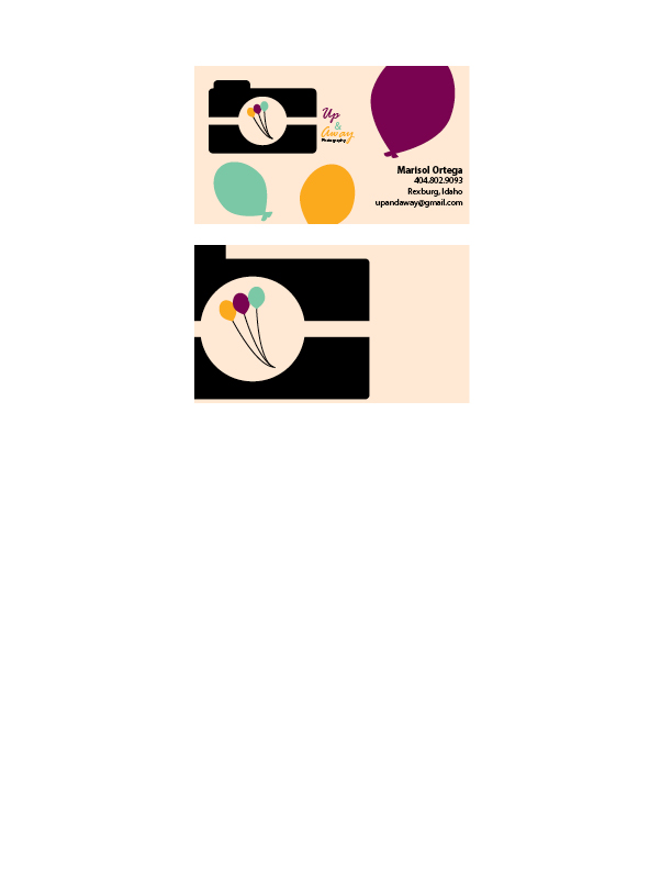
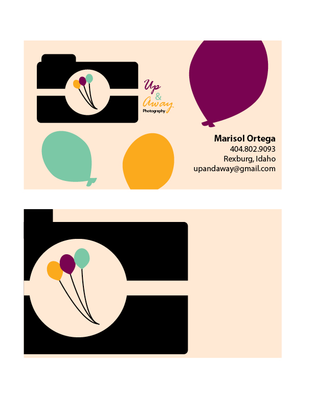
- Description: This is business card and letterhead for a photography business. The business card and letterhead are matching designs.
- Process (Programs, Tools, Skills): I began these designs by sketching out possible designs. I used the logo that portrayed the name of company and the type of business it is best. I used the elliptical tool to create the camera. As well as the balloons. I used the path tool to form a balloon shape out of the three circles; as well as the balloon string. I used the colors on the balloons for the words as well to add repetition. The programs I used were Illustrator and InDesign.
- Message: Up & Away is a photography business for families. They photograph newborns, maternal, and families. This logo is playful in order to appear to the younger audiences and families.
- Audience: The audience is families.
- Top Thing Learned: I learned that consistency gives the company a theme and makes it memorable.
- Color scheme and color names: Big Split Complementary; Teal, Gold, Brick, Violet.
- Title Font Name & Category: Rage Italic – Script
- Copy Font Name & Category: Myriad Pro – Sans Serif
Project 5: Logos
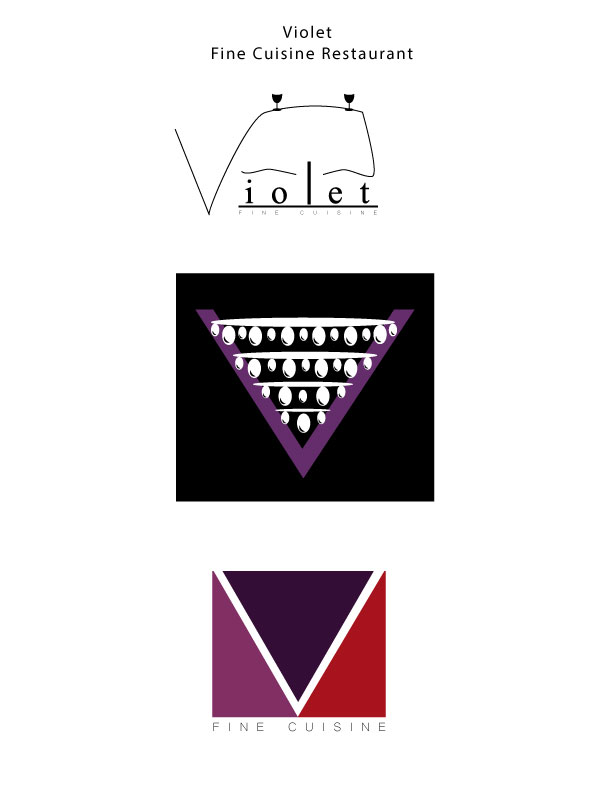
- Description: These are three different logos for a restaurant called, “Violet.”
- Process (Programs, Tools, Skills): I had a really fun time designing on Illustrator. The process was very fun to explore. My top logo was created with the pen tool. I then created the wine glasses with the ellipse tool. My middle logo was created with many ovals using the ellipse tool to design a chandelier. The “V” was created with two triangles. The bottom logo was created with a rectangle and a triangle to form a “V”.
- Message: Violet is a fine cuisine restaurant that is modern and elegant.
- Audience: People looking for a modern and elegant place to dine in.
- Top Thing Learned: I learned that watching the tutorials helps me teach myself, making this learning experience more valuable.
- Three Color Scheme and Color Names: Top logo: Black; Middle Logo: Monochromatic; Bottom logo: Analagous. Color names- Top Logo: Black; Middle Logo: Violet; Bottom Logo: Purple, Violet, Red.
- Top Logo – Font #1 Name & Category: Myriad Pro; Oldstyle
Top Logo – Font #2 Name & Category: Microsoft Yi Baiti: Sans Serif Middle Logo – Font #1 Name & Category: No font
Middle Logo – Font #2 Name & Category: No font - Votes on favorite logo: Top Logo = _4__; Middle Logo = _1__; Bottom Logo = _8__;
- My favorite logo is ___Top Logo___.
Project 4: Montage
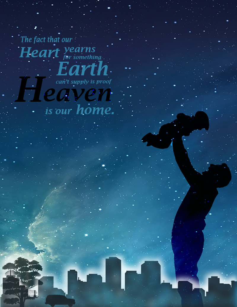
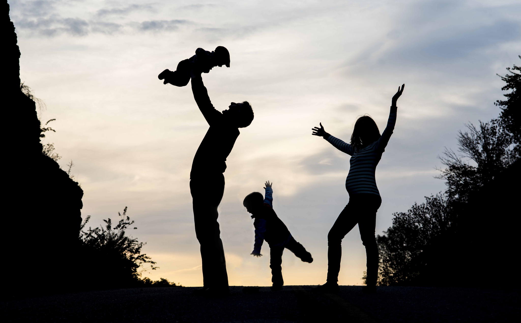
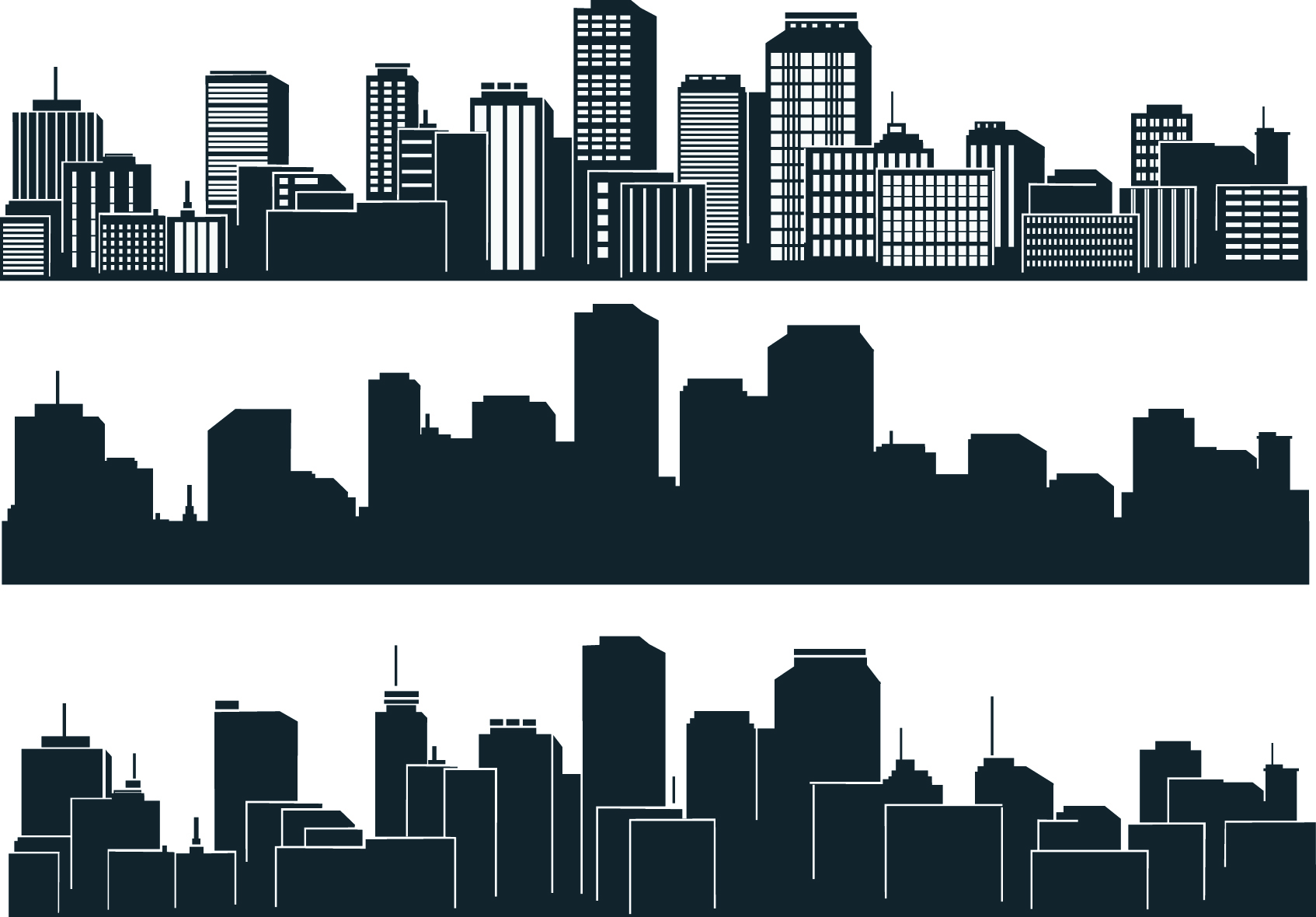
- Description: This is an inspirational montage using a quote from C.S. Lewis. This design was done by blending five images and typography.
- Process (Programs, Tools, Skills, Steps taken while designing): I first began by cropping the background image so that it fit 8.5 x 11 in. I then found a few silhouettes that when with the quote and used the Lasso tool and 20% Feather and moved them onto my image. I used a mask on all of those images and used the brush tool with a 40% opacity to blend them into the image. I left some with hard edges because I believed they added to the design. The buildings were blended in more than the others. For the silhouette of the father and son, I used the Overley blend to have it match with the background image. I used Divide for the word Heaven. I used Adobe Photoshop for this design.
- Message: I wanted to design a spiritual poster that reminds us all that Heaven is our home. I believe C.S Lewis explains this very spiritually.
- Audience: Those who have a religious background or are interested in spiritual things/ideas.
- Top Thing Learned: I learned how to blend images, use the Lasso tool, the brush tool, and how to use masks to avoid destroying a photo.
- Filter / Colorization used and where it was applied: I added a bit of vibrancy to the background image.
- Color scheme and color names: Monochromatic: Blue
- Title Font Name & Category: Lucida Bright Demibold Italic- Oldstyle
- Copy Font Name & Category: None
- Thumbnails of Images used:
-


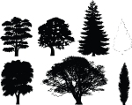
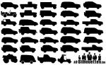
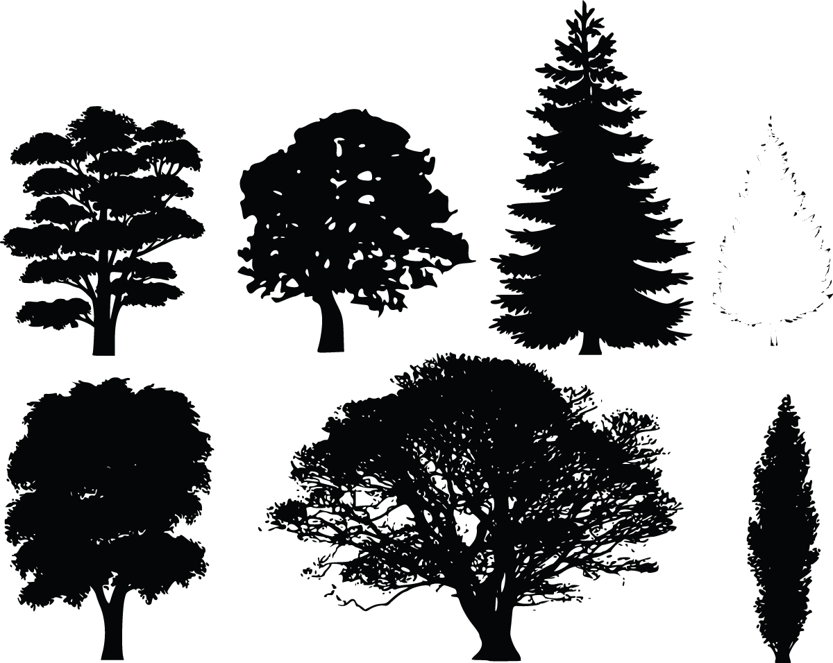
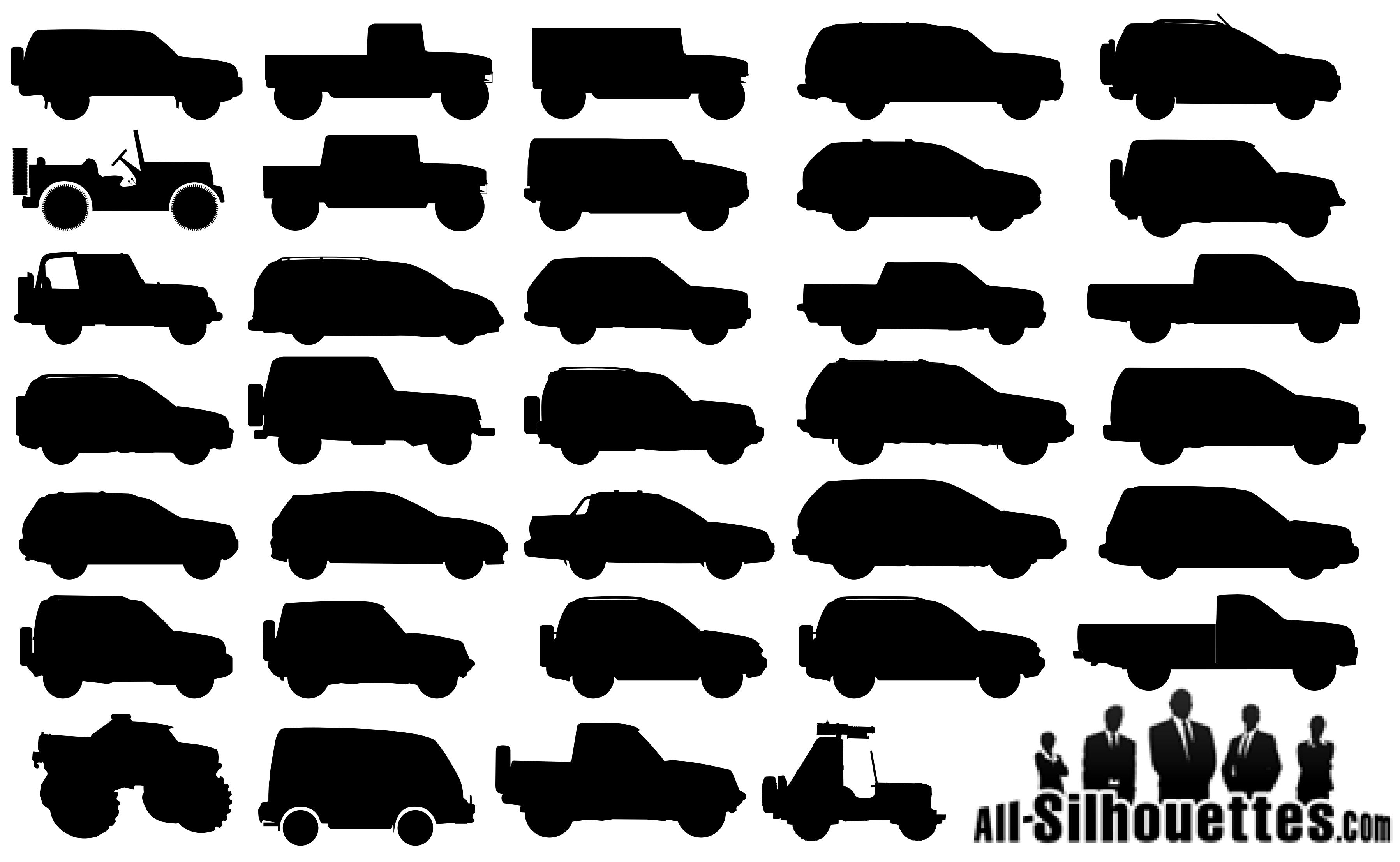
- Sources (Links to images on original websites / with title of site): HDW:http://hdw.eweb4.com/wallpapers/2122/ Blessed Family Chiro: http://www.blessedfamilychiro.com/wp-content/uploads/2014/06/2048.jpg Clipart Of: http://free.clipartof.com/details/8-Free-Clipart-Of-7-Tree-Silhouettes Juimg: http://www.juimg.com/shiliang/201401/chengshifengguang_471934.html Free Logo Vectors: http://www.freelogovectors.net/?s=cars

Project 3: Photodesign
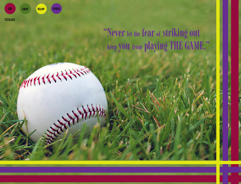
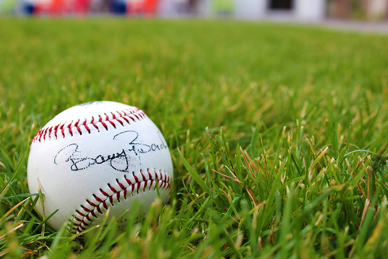
- Description: This is an inspirational poster that portrays good photography and image editing skills. The image used for this photo is an original and was edited to go with the poster.
- Process (Programs, Tools, Skills): I began this design by taking a lead room photo that had a color scheme I could work with. I took the photo with a T5 Rebel Canon camera. I used a lead room baseball photo that I could use for an inspirational sport poster. After taking some photos, I used Photoshop to edit and enhance the color I would be using for the design. I used the following edit techniques: Levels, Vibrance, Sharping tool, and Patch tool. I added thin rectangles for repetition, rule of odds, and asymmetry to contrast the round shape of the baseball. I added a quote that was motivational and included sport terminology.
- Message: I wanted to create a motivational poster that could relate to life as well as sports.
- Audience: I decided to make the poster youthful and appealing to a modern audience.
- Top Thing Learned: I learned how important it is to size things from the beginning. I also learned that it is possible to make something appealing when something is forced into the design.
- Color scheme and color names: Tetradic: Red, Green, Yellow, Purple
- Title Font Name & Category: Font: Modern 735 BT Alt; Category: Modern
- Copy Font Name & Category: No copy font.
- Thumbnail of original, unedited image inserted

- Date and location you took the photo(s) Tuesday, October 14, Sunrise Village lawn area.
P3 Activity: Photography
Light 1: Outside
Light 2: Inside
Focus 1: Foreground
Focus 2: Background
Composition 1: Thirds
Composition 2: Lead Room
This was the first time I used my new digital camera correctly to shoot some professional photos. It was a really great learning experience as I gathered my ideas and brought them to life through a lens. In the photo of the Taylor building, I woke up early in the morning to catch natural light at a unique place. I used natural window light and a reflector to photograph some desk items. In the focus photos, I learned how to put my camera at spot metering and I also put it in manual lens. This helped me control what I wanted focused.
For the rule of thirds photo, I headed to Porters and found that the light switched were vertically on a third line, as well as some of the horizons. I used a signed baseball as my subject for lead room. I had it face the right side of the page to give it some lead.
Project 2 Event Ad
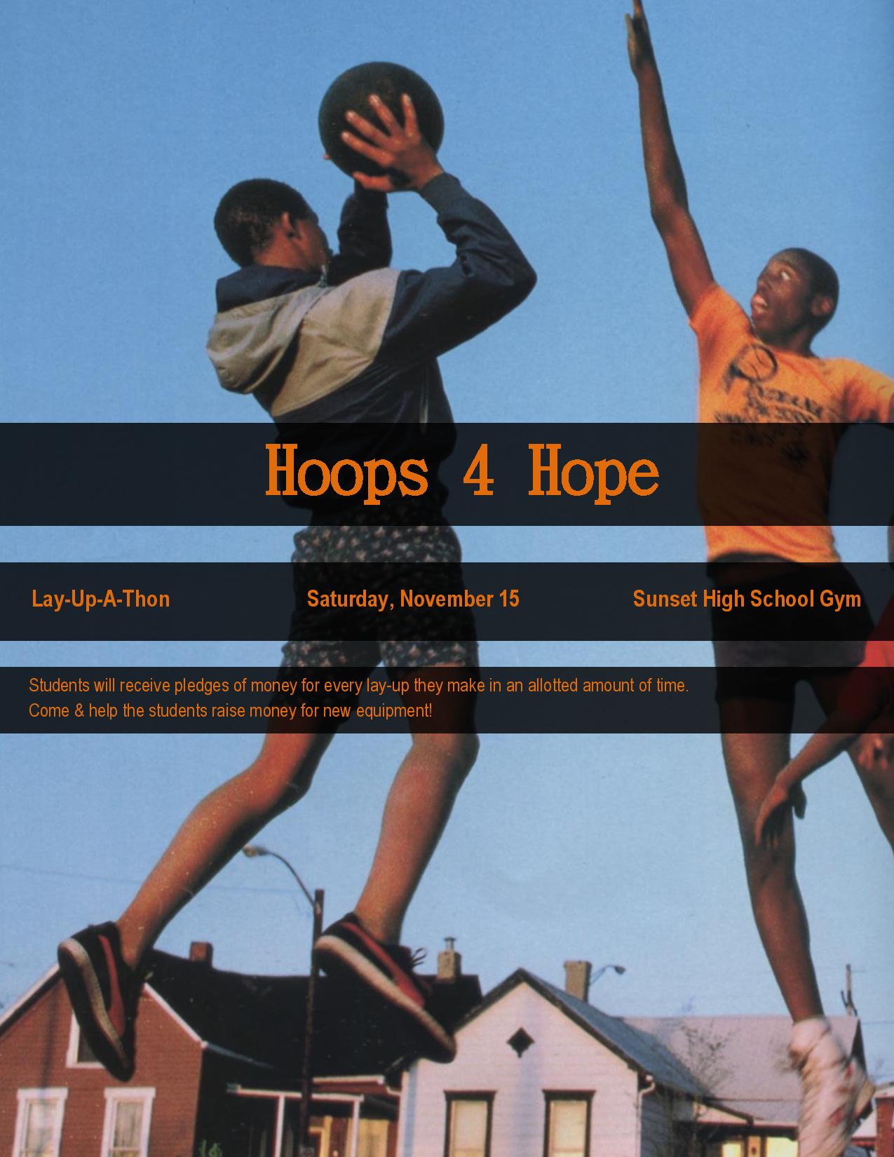
- Description: This is a color event ad used to promote a fundraiser called, “Hoops 4 Hope”. It was created using Microsoft.
- Process (Programs, Tools, Skills): I began this project by scanning in a photo of two young boys playing basketball. I then opened it up in Microsoft Word and made it the background of the ad. I added 3 rectangles to follow the rule of odds. I looked at the color scheme of the photo and noticed that orange text would match the young mans shirt. This was a great color scheme: blue and orange. I put the three rectangles in the center because even with them on the center of the photo one can see what is going on. If it were in the bottom or top, it would throw off the image. I used a text that looked retro to match the 80’s ad.
- Message: I created this ad for an organization called, “Hoops 4 Hope.” I want those who see the ad to know that this fundraiser will help the youth and allow them to keep playing basketball at their school. The ad is simple because I want them to know it is all about the youth.
- Audience: The audience is students that attend Sunset High School, parents of the students, and those in the community.
- Color scheme and color names: Complementary, Blue & Orange.
- Top Thing Learned: I learned how much fun it is to work with color scheme. And that it is a very important element of design.
- Title Font Name & Category: DFKai-SB – Slab Serif
- Copy Font Name & Category: Arial Narrow – Sans Serif
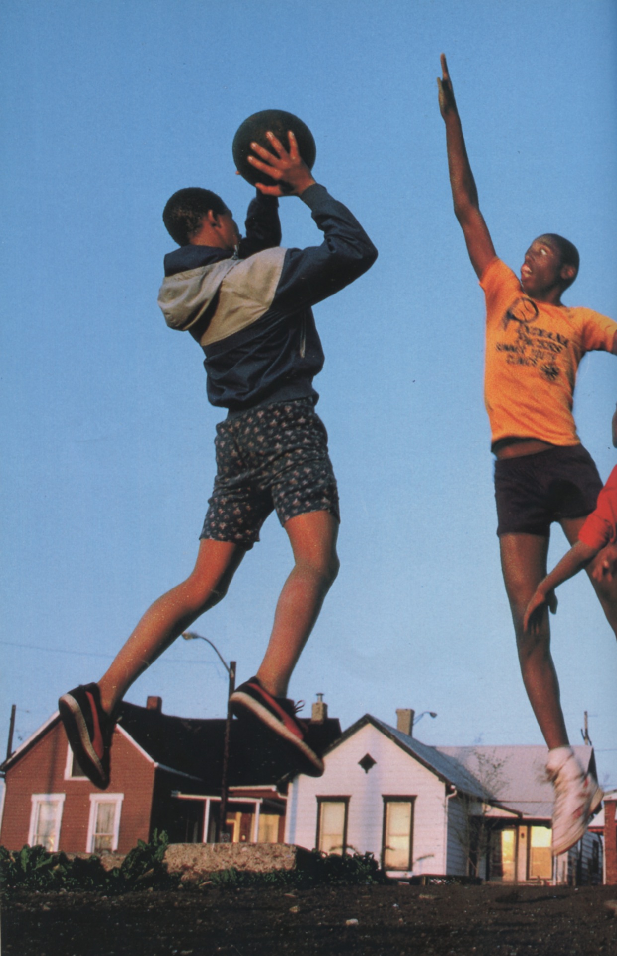
- Scanned images used, sources, original sizes, location of scanner used:
This image was scanned from the August 1987 National Geographic magazine. The image was originally 6.2” x 9.64”. I scanned the image at 200 dpi to make the image larger. The final size of image was 1242” x 1925”.
Project 1: Flier
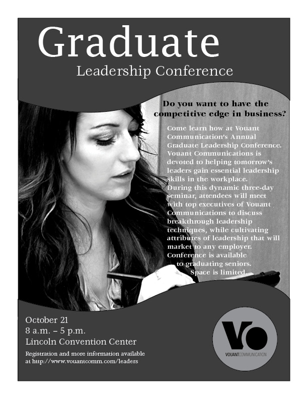
Description: This is a black & white flier for a Graduate Leadership Conference.
Process (Programs, Tools, Skills): I began this project by sketching out possible designs for the flier. I chose one of the sketches and designed the layout using Adobe InDesign. I decided to use curvy edges in the design repeatedly to create unity in the design. I added contrast in the title by making one of the words larger and a different font than the others. I made the question, ” Do you want to have the competitive edge in business?” larger and black so that it would stand out from the body. I left plenty of white space at the top and bottom of the flier. This allows for the event name and date to be the focal point of the flier. I was provided the logo, image, and text of this flier.
Message: I am reaching out to students who will be graduating soon or who are recent graduates to inform them about the opportunity they have to attend this conference that can help them become leaders in the workforce.
Audience: The audience I created this flier for are recent or soon to be graduates in between the ages 21-30.
Top Thing Learned: I learned how to use the pen tool, which helped me design the curvy elements in the flier.
Title Font Name & Category:
Lucida Fax – Slab Serif
Copy Font Name & Category:
ITC Veljovic – Oldstyle
Links to images used in this project:
